

Bank of Baroda
Redesign
Sabrina shaikh
Tools used :

Project overview
As an Bank of baroda user I identified significant improvement in the bank of baroda banking app. The primary goal of this UI/UX redesign is to enhance the Bank of Baroda mobile banking app. The redesign will focus on addressing current usability challenges, improving navigation and introducing a more balanced and modern design language.
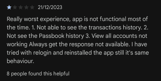
Understanding some bad reviews
Let’s find out.
Problem
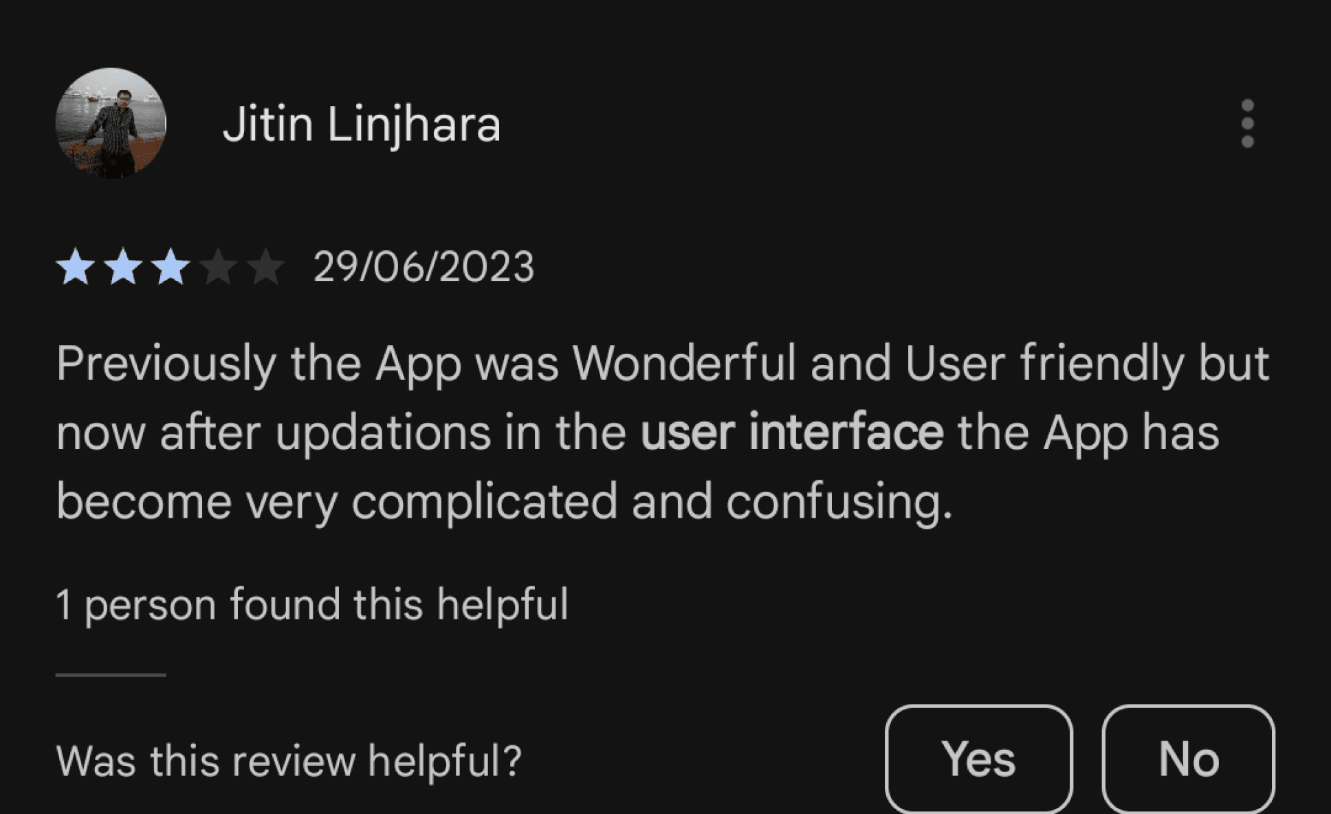
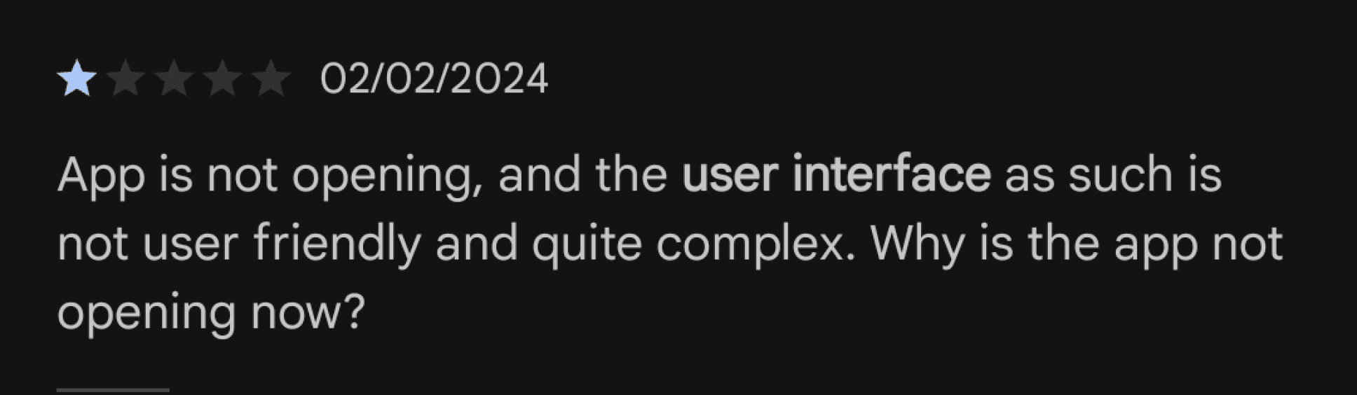
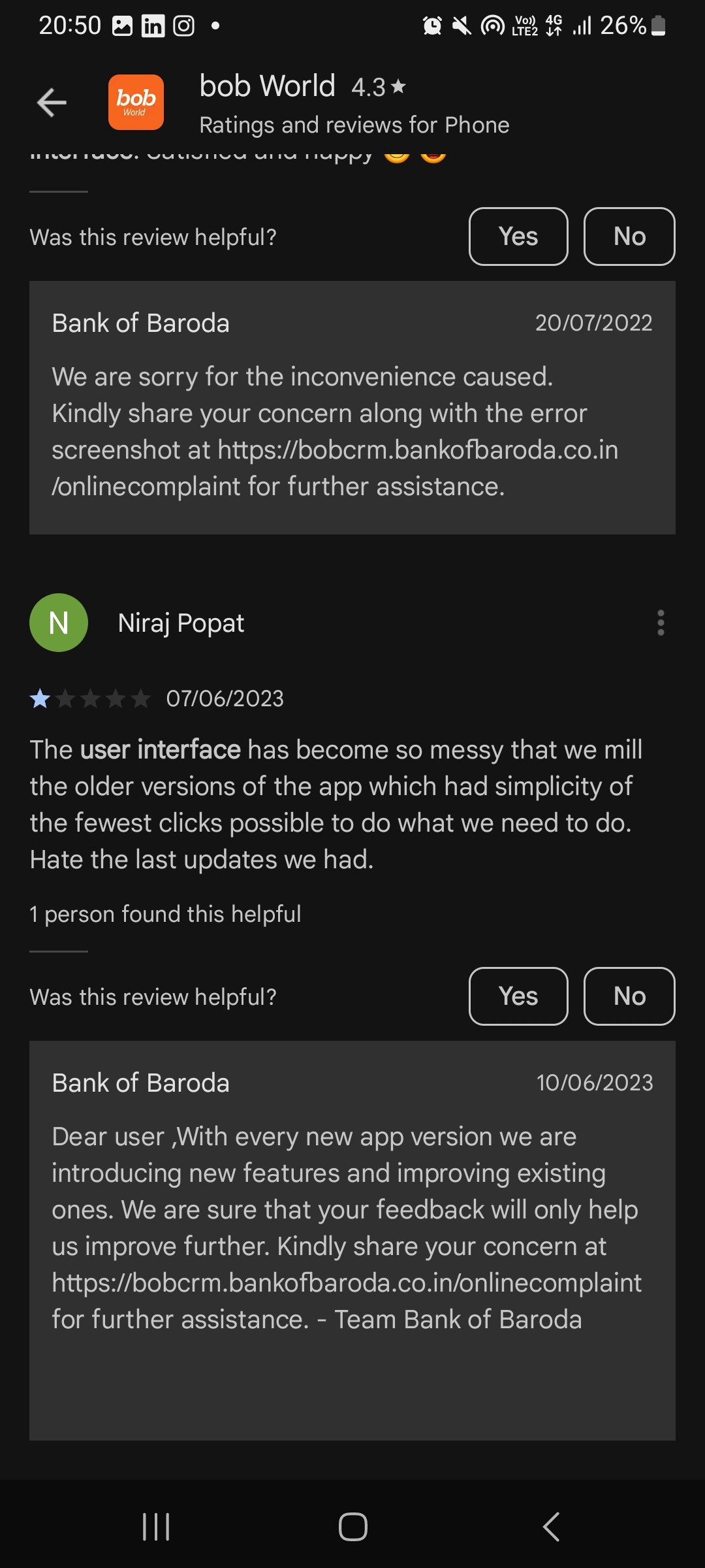
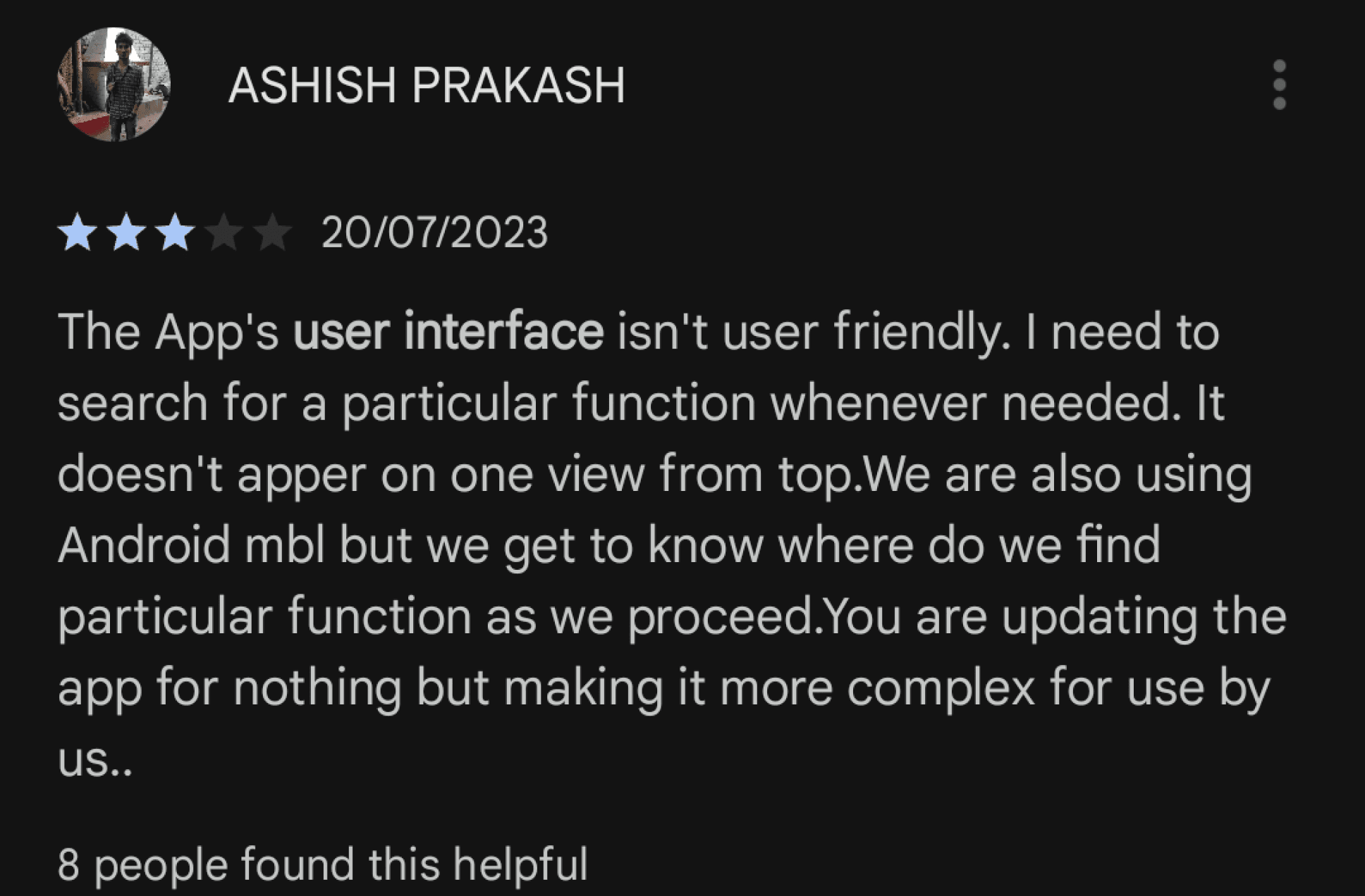
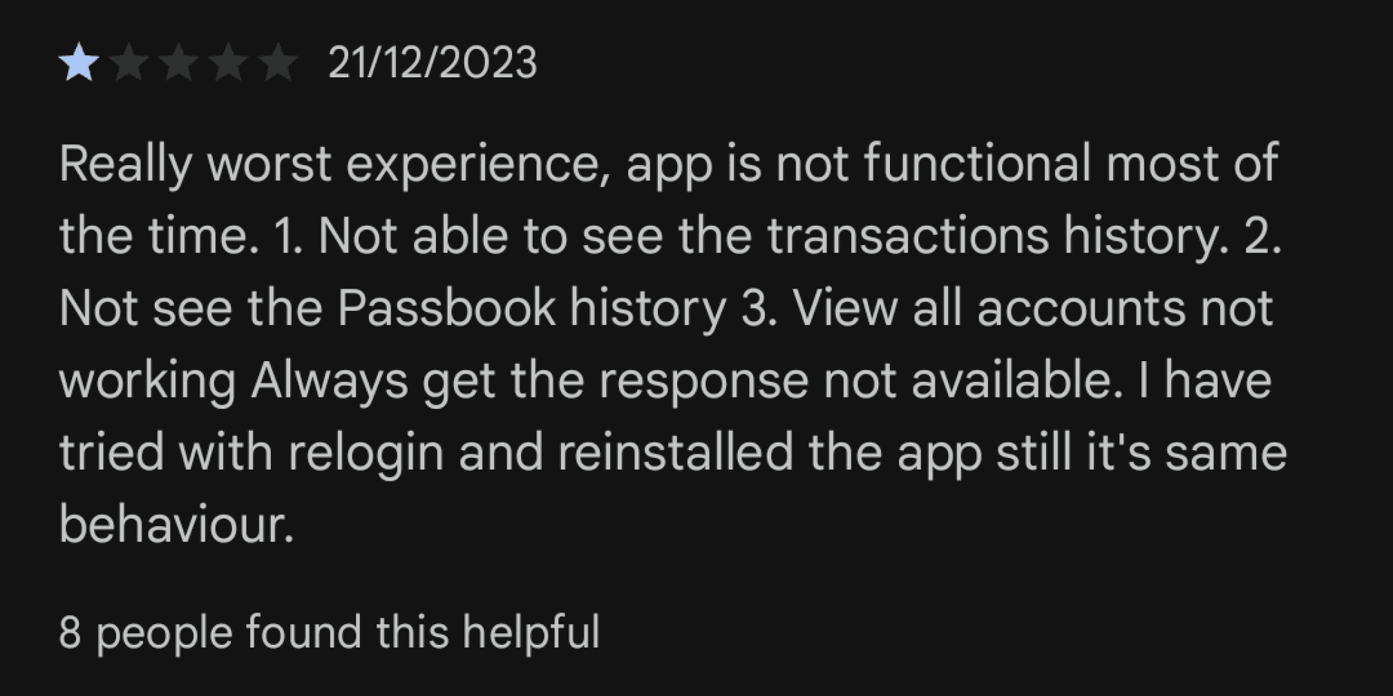
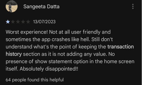
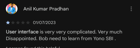
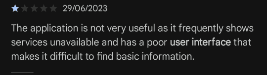
As highlighted by the users review on the google playstore, user face difficulties with the bank of baroda mobile banking app.
The design lacks appeal, feature confusing elements and utilizes color poorly, resulting in cluttered and unattractive
Ads within the app proves distracting, frustrating, negatively impacting the user experiance.
Navigation is challenging, making it hard for users to find and utilize essential features efficiently.
Solution
Goal is to simplify the user experience, making the app easy to navigate, visually pleasing , and user friendly
Taking the current feature to the next level to enhance the app’s efficiency and useful for user
But what's the problem in the app ?
Research
The first step of the reserach was to check out the functionality and user interface of the bank of baroda looks like.Below are some of the example of what app interface looked like before we redesign it.It also include a short dive into existing usability issue which we later fixed.
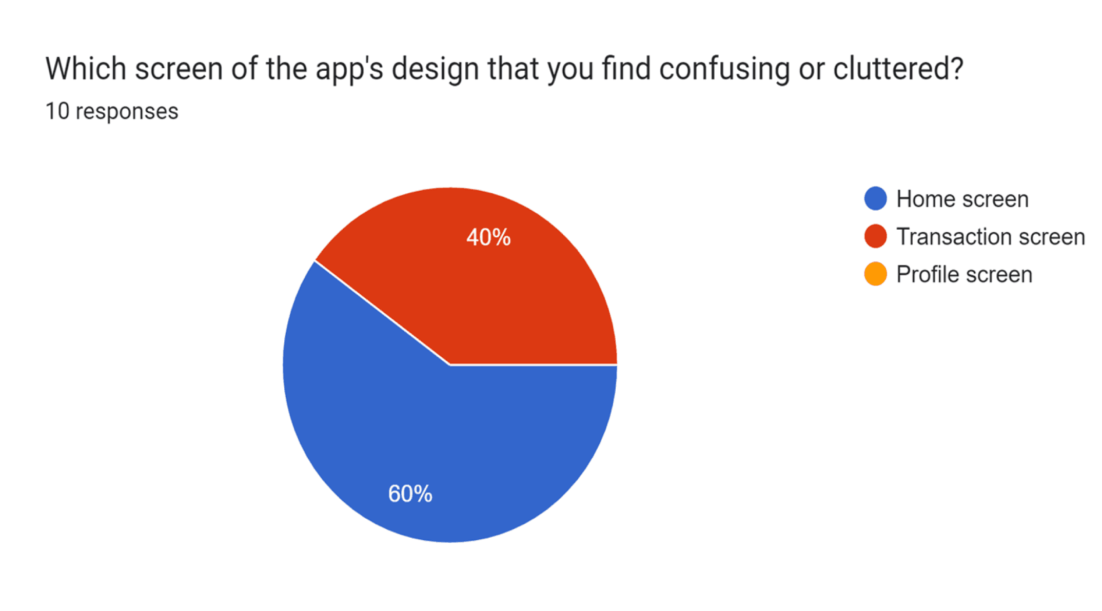
Selected screen for redesign
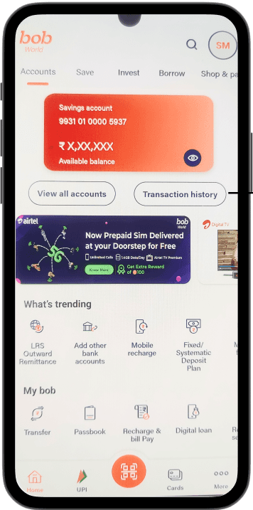
The home page has a few usability issues that need attention to improve the overall user experience. One big problem is the excessive empty space, making the layout feel unbalanced. This not only doesn't look good but also wastes valuable screen space. The inconsistent placement of elements adds to the clutter and makes it harder for users to find what they need. Additionally, there are too many options on the home page, overwhelming users and distracting them from the main purpose of the platform. Finally, there are too many ads, which not only take away from the content but also make it harder for users to engage with the platform.
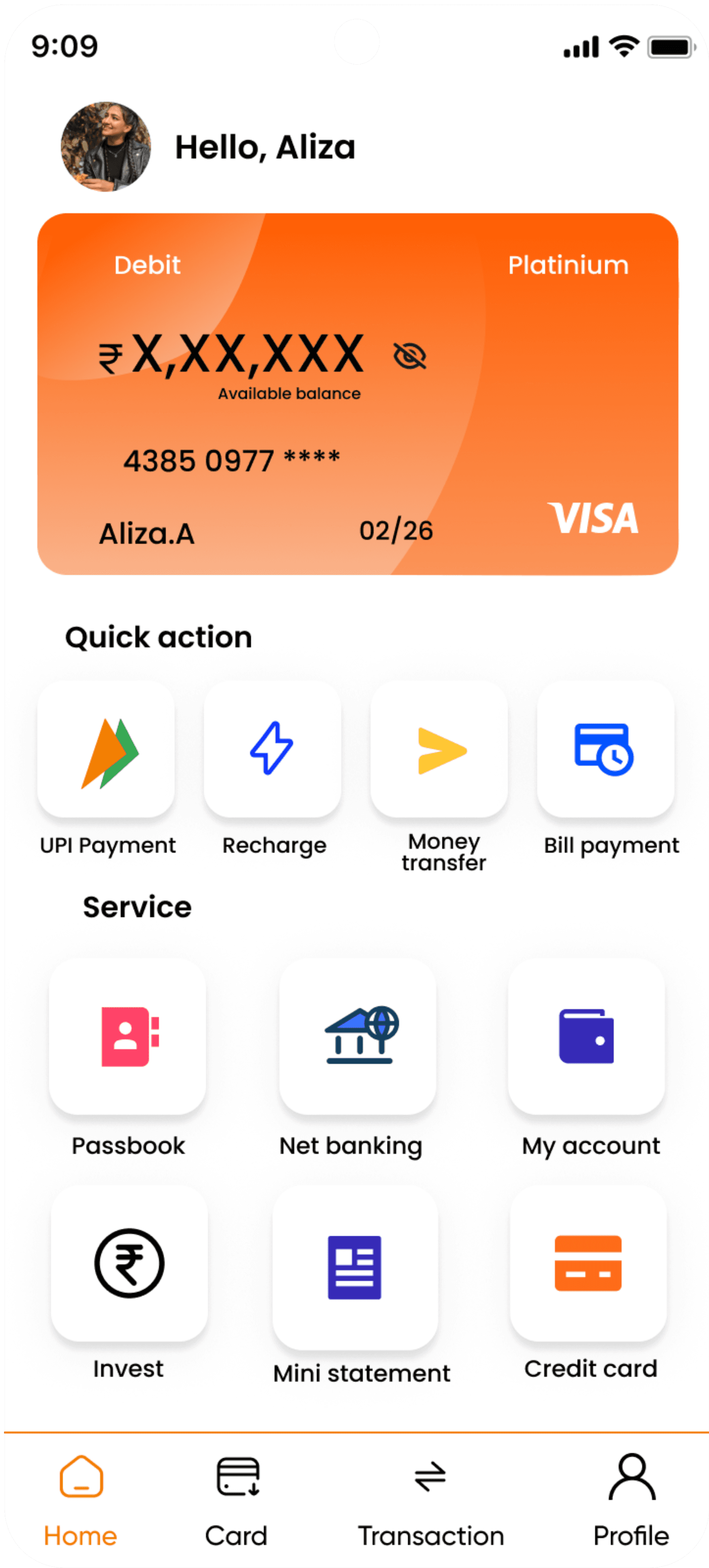
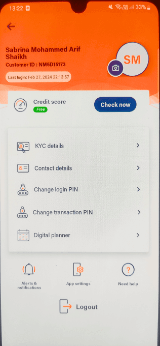
Home screen


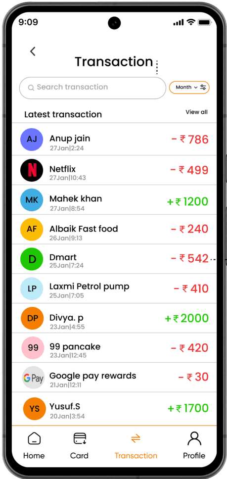
Transaction screen
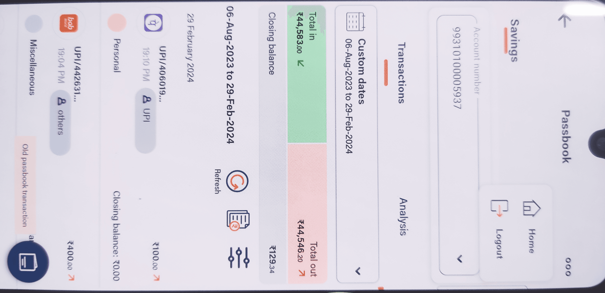

The transaction screen within the app is found within the passbook section, which might not immediately catch the attention of users who are unfamiliar with its location. However, to make things easier for users, we've implemented a separate section specifically dedicated to transactions, clearly labeled with a distinct title. This helps users identify and navigate to the transaction screen more seamlessly. Streamlined the transaction screen by removing unnecessary elements such as analysis tools, refresh and account statement focusing solely on the user's transaction history. Additionally, we've eliminated redundant back buttons and the logout option, ensuring a cleaner and more focused user experience centered on accessing transaction history efficiently.
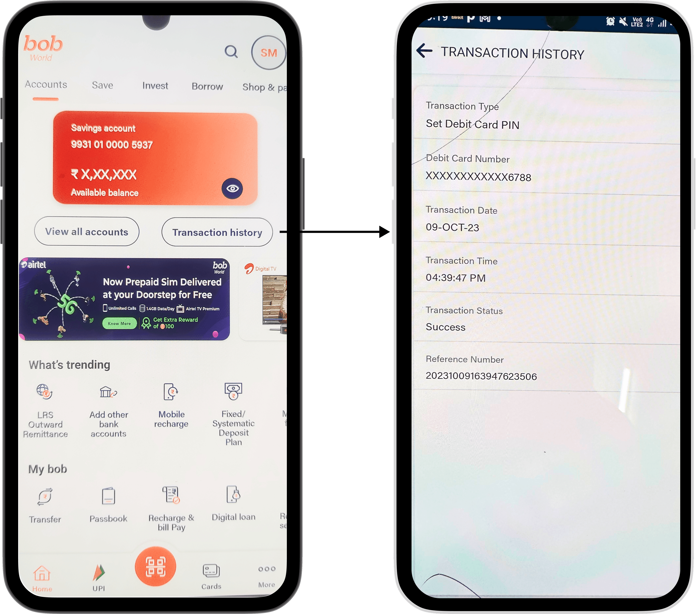
The placement of the transaction history button on the home screen has caused confusion among users who expect immediate access to their transaction records upon clicking it. As a result, users may wonder where their transaction information is located, leading to frustration and a potential loss of confidence in the user interface.


Collected quantitative data to gain valuable insight about the current app interface and functionality

Added quick action to the home screen as it provides users witrh easy access to frequently used features and functions
I've organized the text title on left navigation on the home screen, adopting a minimalist approach. The home screen now showcases only the primary services, ensuring a clean and uncluttered interface. This optimization of space enhances the user experience by providing quick access to key features.
I revamped the bottom navigation bar by focusing on essential functions like Home, Card, Transaction, and Profile. This redesign aims to streamline access, creating a more user-friendly and straightforward navigation experience. Users can easily navigate between key features, enhancing overall usability.
Redesign screens
Home Page
The account button has been refined for quick access to multiple accounts. Switch, navigating between different accounts is made intuitive and efficient within the app.
Thankyou for watching
What I Learned
My first UX redesign was an exciting learning experience. Here are some important thing that I learned :
User-Centric Design: Putting the user at the center of the design process is crucial. Understanding user needs, preferences, and pain points through research and testing is essential for creating a successful product.
Importance of Usability Testing: Usability testing provided insights into how users interact with the app and helped identify areas for improvement. It highlighted usability issues that may not have been apparent otherwise.
Iterative Design Process: Redesigning the app likely involved multiple iterations based on user feedback. Embracing an iterative design process allows for continuous improvement and refinement of the product.
Simplification and Clarity: Simplifying the app's interface and improving clarity of information likely led to a better user experience. Users appreciate intuitive design that makes it easy to accomplish tasks and understand their financial information.
Final designs
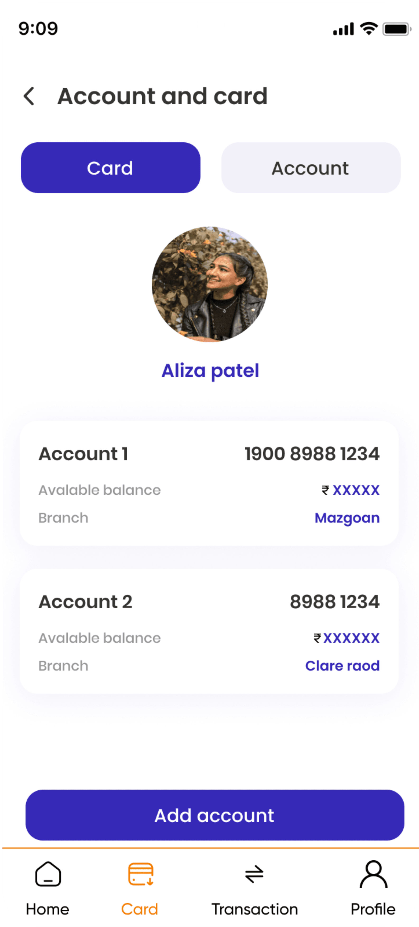

Profile screen
The redesigned profile screen now provides a clean and user-friendly layout for managing Aadhar, PAN, Kyc, contact information, and various features, including customer service, feedback and the security center. This ensures easy access and enhanced control over personal information.
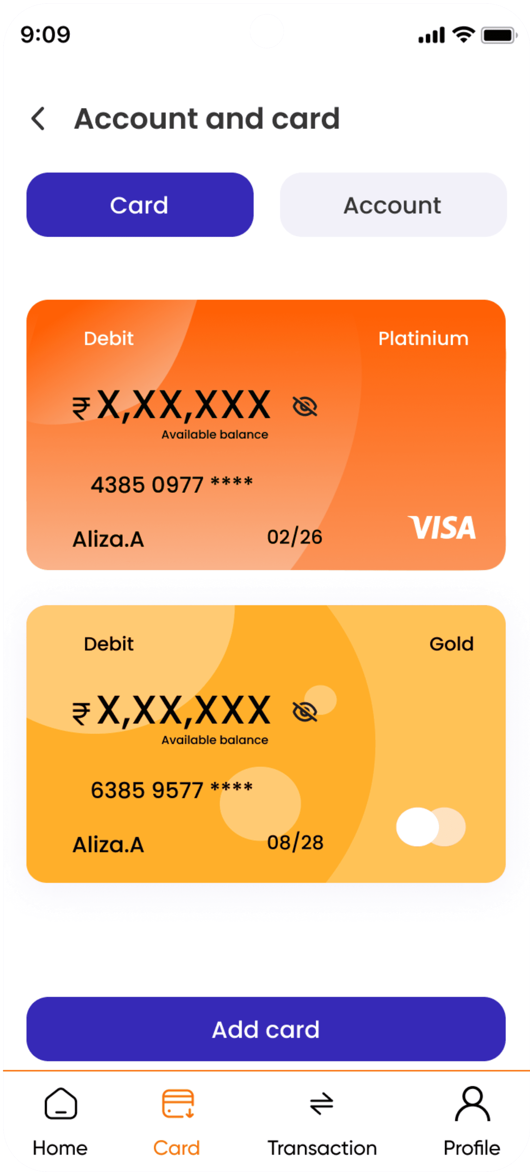
Card screen
Transaction screen

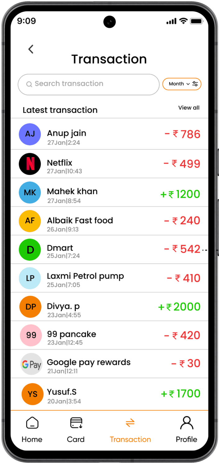
I've added a search bar to enhance user convenience, enabling them to quickly locate specific transactions.
I've introduced a time filter, such as a month or week feature, to enhance user control, enabling efficient transaction tracking and made the button smaller and not taking ample of space
I've included debited and credited amounts, as well as payment types, in the transaction history to enhance transparency. This addition provides users with insights into their spending and payment methods, offering a clearer and more comprehensive view of their financial activities. The interface is streamlined, removing unnecessary clutter to create a more appealing and user-friendly experience. Users can easily navigate through their financial activities, with options for filtering, sorting, and searching transactions.
The redesigned card screen offers a clean and user-friendly layout for efficient management of cards and accounts. Its simplicity ensures easy access and control. Additionally, the flexible design allows for seamless integration of new features, enhancing the overall user experience.
Firstly, the presence of unnecessary illustrations clutters the interface and distracts users from the core functionality of the app.Additionally, the color scheme is dull and unattractive, failing to captivate users' attention or create a visually engaging experience.To improve the screen's design, it is essential to adopt a more aesthetic and minimalist approach.
In essence, by refining the interface to include crucial features such as contact information, a security center, and comprehensive customer service options, while maintaining a clean and minimal design, the platform can significantly enhance user satisfaction and engagement, ultimately driving long-term success and growth.


Card screen
In the next step we did user research to understand the bank of baroda app better. We used survey to gather data about the thinking of users while using the app and what users do. This is to better understanding the user’s motivation and frustration within the app
User research


Moved to the ideation part where you can bring together all the insights gathered from research and start generating creative solutions.
IDEATION
Solution
Style guide
Semi bold
poppins
Aa
Poppins geometric shapes keep the type readable in small size, while its modern yet timeless curves look blown up on big screens on mobile devices.
Regular
Medium
#FF620A
#0E0E0E
#3629B7
#D9D9D9
In our redesigned solution, we made sure to solve the existing problems withing the interface of the app. Some problems we addressed through our redesign were :
Simplify the layout to make it easier for users to navigate.
Use a clean and modern design language with intuitive icons and buttons.
Improving the overall UI for user and making it pleasing
Making the transaction screen less confusing and better

Bank of Baroda
Redesign
Sabrina shaikh
Tools used :
Project overview
As an Bank of baroda user I identified significant improvement in the bank of baroda banking app. The primary goal of this UI/UX redesign is to enhance the Bank of Baroda mobile banking app. The redesign will focus on addressing current usability challenges, improving navigation and introducing a more balanced and modern design language.
Understanding some bad reviews
Let’s find out.


Problem
As highlighted by the users review on the google playstore, user face difficulties with the bank of baroda mobile banking app.
The design lacks appeal, feature confusing elements and utilizes color poorly, resulting in cluttered and unattractive
Ads within the app proves distracting, frustrating, negatively impacting the user experiance.
Navigation is challenging, making it hard for users to find and utilize essential features efficiently.
Solution
Goal is to simplify the user experience, making the app easy to navigate, visually pleasing , and user friendly
Taking the current feature to the next level to enhance the app’s efficiency and useful for user
But what's the problem in the app ?
Research
The first step of the reserach was to check out the functionality and user interface of the bank of baroda looks like.Below are some of the example of what app interface looked like before we redesign it.It also include a short dive into existing usability issue which we later fixed.
Selected screen for redesign
The home page has a few usability issues that need attention to improve the overall user experience. One big problem is the excessive empty space, making the layout feel unbalanced. This not only doesn't look good but also wastes valuable screen space. The inconsistent placement of elements adds to the clutter and makes it harder for users to find what they need. Additionally, there are too many options on the home page, overwhelming users and distracting them from the main purpose of the platform. Finally, there are too many ads, which not only take away from the content but also make it harder for users to engage with the platform.
Home screen
Transaction screen
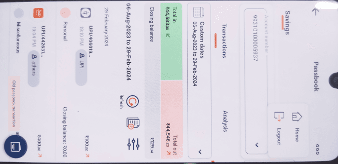
The transaction screen within the app is found within the passbook section, which might not immediately catch the attention of users who are unfamiliar with its location. However, to make things easier for users, we've implemented a separate section specifically dedicated to transactions, clearly labeled with a distinct title. This helps users identify and navigate to the transaction screen more seamlessly. Streamlined the transaction screen by removing unnecessary elements such as analysis tools, refresh and account statement focusing solely on the user's transaction history. Additionally, we've eliminated redundant back buttons and the logout option, ensuring a cleaner and more focused user experience centered on accessing transaction history efficiently.

The placement of the transaction history button on the home screen has caused confusion among users who expect immediate access to their transaction records upon clicking it. As a result, users may wonder where their transaction information is located, leading to frustration and a potential loss of confidence in the user interface.
Firstly, the presence of unnecessary illustrations clutters the interface and distracts users from the core functionality of the app.Additionally, the color scheme is dull and unattractive, failing to captivate users' attention or create a visually engaging experience.To improve the screen's design, it is essential to adopt a more aesthetic and minimalist approach.
In essence, by refining the interface to include crucial features such as contact information, a security center, and comprehensive customer service options, while maintaining a clean and minimal design, the platform can significantly enhance user satisfaction and engagement, ultimately driving long-term success and growth.

Card screen
User research


Collected quantitative data to gain valuable insight about the current app interface and functionality
Moved to the ideation part where you can bring together all the insights gathered from research and start generating creative solutions.
IDEATION
Solution
Style guide
Semi bold
poppins
Aa
Poppins geometric shapes keep the type readable in small size, while its modern yet timeless curves look blown up on big screens on mobile devices.
Regular
Medium
#FF620A
#0E0E0E
#3629B7
#D9D9D9
In our redesigned solution, we made sure to solve the existing problems withing the interface of the app. Some problems we addressed through our redesign were :
Simplify the layout to make it easier for users to navigate.
Use a clean and modern design language with intuitive icons and buttons.
Improving the overall UI for user and making it pleasing
Making the transaction screen less confusing and better
Added quick action to the home screen as it provides users witrh easy access to frequently used features and functions
I've organized the text title on left navigation on the home screen, adopting a minimalist approach. The home screen now showcases only the primary services, ensuring a clean and uncluttered interface. This optimization of space enhances the user experience by providing quick access to key features.
I revamped the bottom navigation bar by focusing on essential functions like Home, Card, Transaction, and Profile. This redesign aims to streamline access, creating a more user-friendly and straightforward navigation experience. Users can easily navigate between key features, enhancing overall usability.
Redesign screens
Home Page
The account button has been refined for quick access to multiple accounts. Switch, navigating between different accounts is made intuitive and efficient within the app.
Profile screen
The redesigned profile screen now provides a clean and user-friendly layout for managing Aadhar, PAN, Kyc, contact information, and various features, including customer service, feedback and the security center. This ensures easy access and enhanced control over personal information.
Card screen
Transaction screen
I've added a search bar to enhance user convenience, enabling them to quickly locate specific transactions.
I've introduced a time filter, such as a month or week feature, to enhance user control, enabling efficient transaction tracking and made the button smaller and not taking ample of space
I've included debited and credited amounts, as well as payment types, in the transaction history to enhance transparency. This addition provides users with insights into their spending and payment methods, offering a clearer and more comprehensive view of their financial activities. The interface is streamlined, removing unnecessary clutter to create a more appealing and user-friendly experience. Users can easily navigate through their financial activities, with options for filtering, sorting, and searching transactions.
The redesigned card screen offers a clean and user-friendly layout for efficient management of cards and accounts. Its simplicity ensures easy access and control. Additionally, the flexible design allows for seamless integration of new features, enhancing the overall user experience.
Thankyou for watching
What I Learned
My first UX redesign was an exciting learning experience. Here are some important thing that I learned :
User-Centric Design: Putting the user at the center of the design process is crucial. Understanding user needs, preferences, and pain points through research and testing is essential for creating a successful product.
Importance of Usability Testing: Usability testing provided insights into how users interact with the app and helped identify areas for improvement. It highlighted usability issues that may not have been apparent otherwise.
Iterative Design Process: Redesigning the app likely involved multiple iterations based on user feedback. Embracing an iterative design process allows for continuous improvement and refinement of the product.
Simplification and Clarity: Simplifying the app's interface and improving clarity of information likely led to a better user experience. Users appreciate intuitive design that makes it easy to accomplish tasks and understand their financial information.
Final designs

